10 Best Nursery Color Combinations for a Peaceful and Calming Room
Preparing for a new arrival is a whirlwind of emotions and tasks, but few things feel as meaningful as creating a space for your baby. When designing a nursery, color selection goes far beyond simple aesthetics. The environment you build can influence your baby’s mood, sleep quality, and overall sense of security.
Choosing the best nursery color combinations is an exercise in creating a haven. In this guide, we explore how to curate a room that is not only beautiful but also inherently peaceful. By understanding the psychology of color, you can transform a simple room into a soothing retreat for both you and your little one.
The Science of Soothing: How Color Affects Babies
Color psychology plays a significant role in child development and physiological responses. Experts generally agree that infants respond most positively to environments that mimic the gentle tones found in nature. A nursery that feels overstimulating can lead to difficulty in settling down for naps or bedtime, whereas a calming color palette can act as a silent lullaby.
Warm vs. Cool Tones: What Experts Recommend
Cool tones, such as blues, greens, and soft lavenders, are scientifically proven to lower heart rates and reduce feelings of anxiety. These colors mimic the sky and earth, providing a grounding effect. On the other hand, warm tones like soft yellows or peaches can evoke feelings of sunshine and happiness. The key is to avoid high-saturation, neon-bright colors, which can overstimulate a developing nervous system.
The Importance of Light-Reflectance and Brightness
When selecting your palette, consider the Light Reflectance Value (LRV) of your paint. Colors with a higher LRV reflect more light, making a room feel airy and open. For a nursery, soft, muted, or pastel versions of your favorite colors are ideal. They offer enough depth to be visually interesting without creating the jarring contrast that bold, dark, or extremely bright colors might introduce.
10 Best Nursery Color Combinations for a Peaceful Room
Finding the right balance of colors can be overwhelming, so we have curated a list of the top combinations to help you visualize your ideal space.
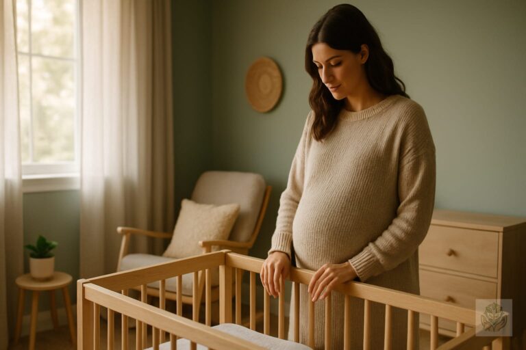
- Sage Green and Soft Cream: This nature-inspired sanctuary brings the calming influence of the outdoors inside, providing a perfect backdrop for organic textures.
- Dusty Blue and Crisp White: A timeless choice that feels inherently airy, clean, and tranquil.
- Warm Greige and Muted Terracotta: A modern, earthy vibe that feels cozy, grounded, and sophisticated.
- Lavender Haze and Pale Gray: Perfect for a soothing and elegant environment that feels slightly whimsical yet perfectly calm.
- Buttery Yellow and Soft White: This combination creates a gentle, warm glow that mimics soft morning light.
- Pale Peach and Sage: An organic, soft contrast that feels fresh and incredibly soothing for a gender-neutral space.
- Charcoal Gray and Sky Blue: If you prefer a darker, cozier aesthetic, this creates a cocoon-like depth that is perfect for sleep.
- Oatmeal and Sand: The ultimate neutral minimalist palette that lets textures and materials take center stage.
- Blush Pink and Muted Gold: A gentle, warm, and sophisticated pairing that feels timeless and high-end.
- Slate Blue and Eucalyptus: A serene, cool-toned escape that offers a mature yet playful twist on classic nursery colors.
How to Balance Your Color Palette
Once you have chosen your favorite nursery color combinations, it is time to apply them effectively throughout the room. Using color wisely ensures the space remains harmonious.
The 60-30-10 Rule for Nursery Design
Designers often use the 60-30-10 rule to create balance. 60 percent of the room should be a dominant color (typically walls), 30 percent a secondary color (furniture or rugs), and 10 percent an accent color (pillows, wall art, or hardware). This prevents any single color from dominating the room and keeps the design feeling intentional.
Incorporating Texture to Add Interest
If you prefer a monochromatic or neutral palette, texture is your best friend. Incorporate chunky knit blankets, velvet curtains, or sisal rugs. These elements add visual depth and tactile stimulation for your baby without the need for bright, chaotic colors.
Tips for Choosing Paint Finishes
For a nursery, opt for eggshell or satin paint finishes. These are easier to clean than flat or matte paint, which is essential for busy parents dealing with minor spills and smudges. However, they provide just enough sheen to look high-quality without being overly glossy.
Beyond the Walls: Coordinating Furniture and Decor
Your wall color is just the beginning. The furniture and textiles you choose will tie the entire room together. For expert tips on layout and keeping the space secure, check out our guide on crib placement tips for a safe nursery.
Selecting Wood Tones
Light wood tones like oak or birch pair beautifully with cool-toned walls and sage greens, creating a Scandinavian-inspired nursery. Darker walnut tones provide a beautiful contrast to lighter walls like cream or pale peach, adding a sense of warmth and permanence to the furniture. When choosing your pieces, be sure to review our safe baby furniture guide to ensure your setup meets all necessary standards.
The Role of Blackout Curtains
Regardless of your color scheme, functional elements are key to a peaceful nursery. Invest in high-quality blackout curtains in a color that complements your palette. These are essential for maintaining a dark environment, which is crucial for daytime naps and preventing early morning wake-ups. For more ideas on designing a restful space, read up on how to create a calm and comfortable sleep environment for kids.
Conclusion
Finding the perfect nursery color combinations is a deeply personal process, but remember that the goal is always serenity. Whether you prefer the grounding nature of sage green or the airy softness of dusty blue, the most important element is how the space makes you feel when you step inside.
Trust your intuition. You know what colors bring you peace, and your baby will likely mirror that sense of comfort. Take your time, test your paint swatches, and enjoy the process of creating this special sanctuary. Do you have a favorite nursery color combination? Let us know in the comments below!
Frequently Asked Questions
Should I paint the nursery ceiling a different color?
Painting the ceiling a slightly lighter shade of your wall color can make the room feel taller. For a cocooning effect, painting it the same color as the walls creates a cozy and sophisticated look.
Are bright colors bad for a nursery?
Bright, neon colors are generally too stimulating for a room intended for rest. If you love bold colors, use them sparingly as small accents in toys or art rather than on large walls.
How do I choose colors for a small nursery?
In smaller rooms, lighter and cooler colors are your best ally because they make walls feel further away. Stick to monochromatic palettes to keep the space feeling open and airy.
What is the best paint finish for a nursery?
Eggshell or satin paint finishes are ideal for a nursery because they are easy to clean while providing just enough sheen without being overly glossy.
How do I use the 60-30-10 rule in a nursery?
Allocate 60 percent of the room to a dominant wall color, 30 percent to secondary furniture or rugs, and 10 percent to accent items like pillows or art to maintain balance.
What colors promote the best sleep for babies?
Cool tones like soft greens, dusty blues, and gentle lavenders are scientifically proven to lower heart rates, reduce anxiety, and promote restful sleep for infants.